Project overview
The product:
Safe Sphere is a mobile app and responsive website designed to keep communities informed and prepared during emergencies like wildfires.
Project duration:
January 22nd, 2025 to February 10th, 2025
The problem:
Natural disasters can occur at any moment, and with the world ever changing it can be difficult to find a reliable source for your area. With the Los Angeles Fires, not many people received alerts to evacuate before it was too late, while other people received false information. This highlights the urgent need for a trustworthy system that ensures communities stay informed and prepared when it matters most.
The goal:
The goal is to create a trusted platform that delivers accurate, real time emergencies based on the users location with hopes to empower communities with reliable information, enabling them to act quickly and confidently during natural disasters, ultimately saving lives and reducing chaos.
User research: summary
When first going into the research, I had believed that people located in this area of CA were aware that they resided in a potential wildfire zone. Which my assumption had been correct, but in doing more research there was not a lot of information on how residents can stay informed on weather conditions in the area. There is a designated site called Sacramento Ready which is a government site, but there is no mobile application or alerts that can inform you of updates in the area. You have to rely on news stations or even social media platforms to get updated information.
Pain Points
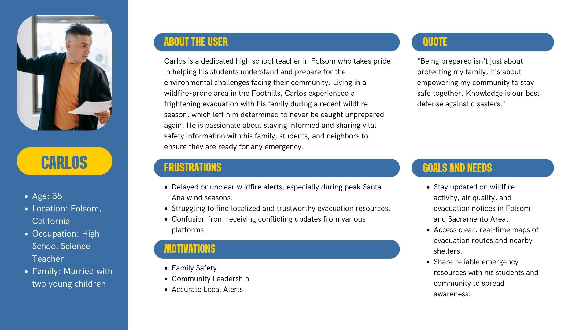
User Personas

Problem Statement
Carlos is a high school science teacher in Folsom, California, who needs reliable, real-time emergency alerts and resources because he wants to ensure the safety of his family and students during wildfire season while feeling confident that the information he shares with his community is accurate and trustworthy.
User journey map
Digital Wireframes
Usability study: findingS
The usability study revealed that users found SafeSphere's navigation to be overall intuitive. The onboarding process was generally well-received, with users appreciating the clear explanations of app features, and have the ability to immediately select notifications and Alerts. Participants reported that the color-coded alert system (red for danger, yellow for caution, green for clear) was effective in conveying urgency. And overall, users found the evacuation alerts helpful.
Low-Fidelity Prototype
Changes after Usability study
The original screen that gave details on the road closures based on the area searched for were a little difficult to read, and were perceived as boxy.
So by editing the style to match the rest of the existing app, it no longer allowed it to be less boxy, but also organized and easier to read.
While it is a small detail, based on my usability study, participants felt that the search bar at the bottle needed more breathing room as it clashed with the end of their phone screens.
So while it is a quick fix, it enables the app to be more user friendly on devices.
Hi-Fi Mockups
Main Screen Mockups
Onboarding Screen Mockups
Accessibility Considerations
Style Guide
Responsive Website