Project overview
The product:
This app and responsive website for public art museums helps promote exhibitions and events, share essential museum information, and make it easy for visitors to schedule their visits.
Project duration:
December 5th, 2024 - December 30, 2024
The problem:
Need an app that efficiently lets you look at museum exhibitions and events, find general information, and schedule visits.
The goal:
Make an easy to use app for a museum that allows people of all ages to use.
User research: summary
When it comes to the age group that is more likely to attend museums, it is categorized as Young adults (under 40, no children) 34%, Parents/guardians of minor children 40%, 40 – 59, no minor children 31%, 60 or older 27% In 2019/20, the most common age groups to visit a museum or gallery were between 25 and 74 years old (54-55%). 45% of those between 16-24 visited at least once in the last 12 months. Both these age groups were significantly more likely to visit than those aged 75 and older (36%).
Pain Points
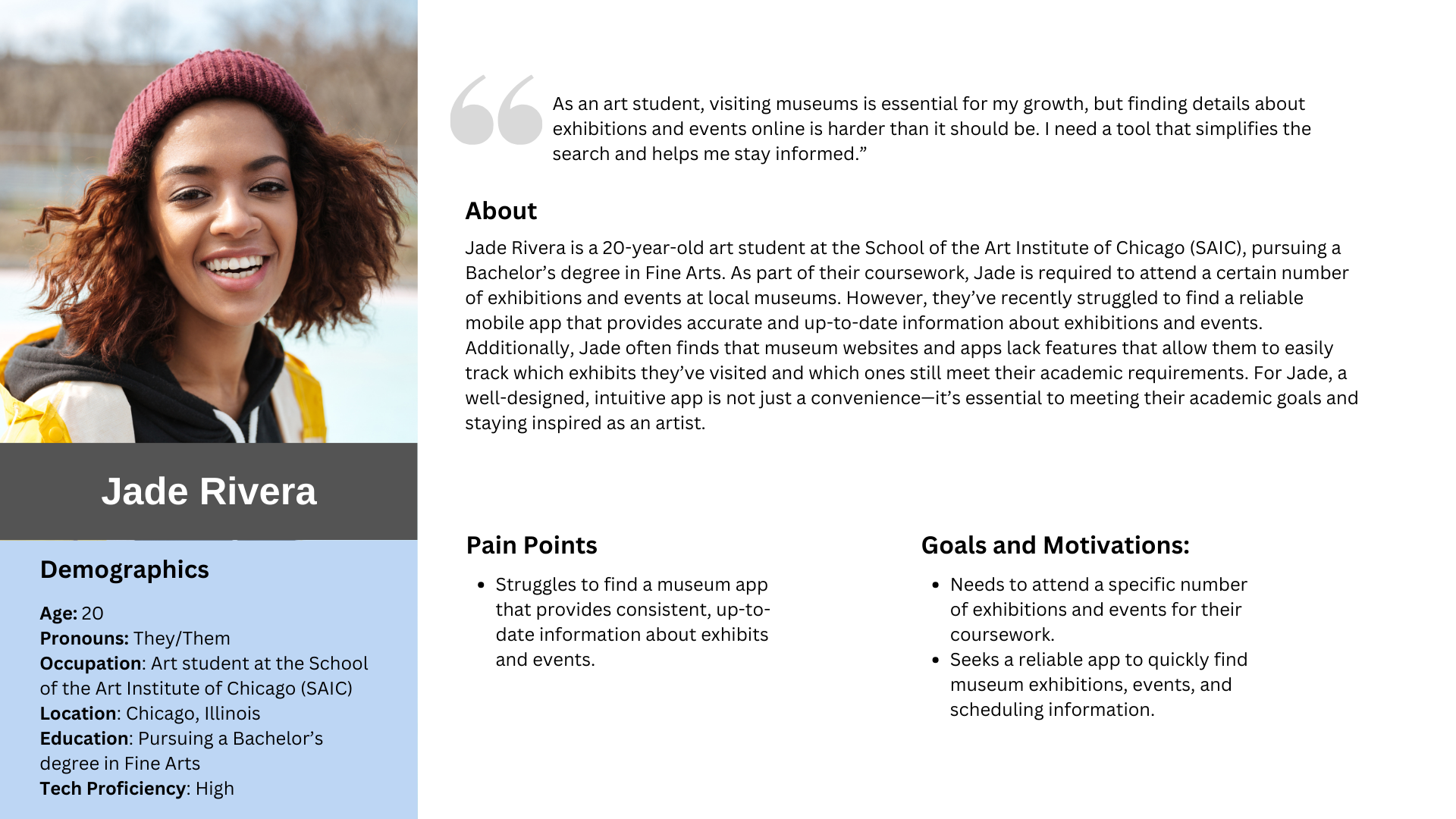
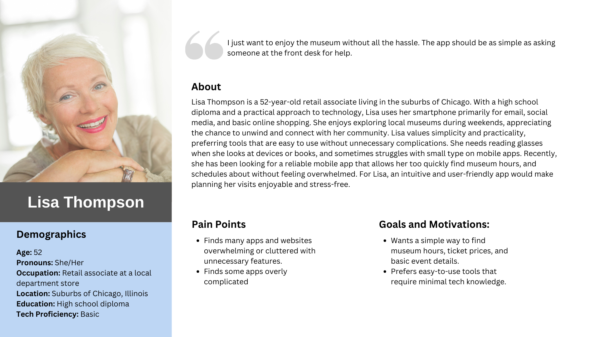
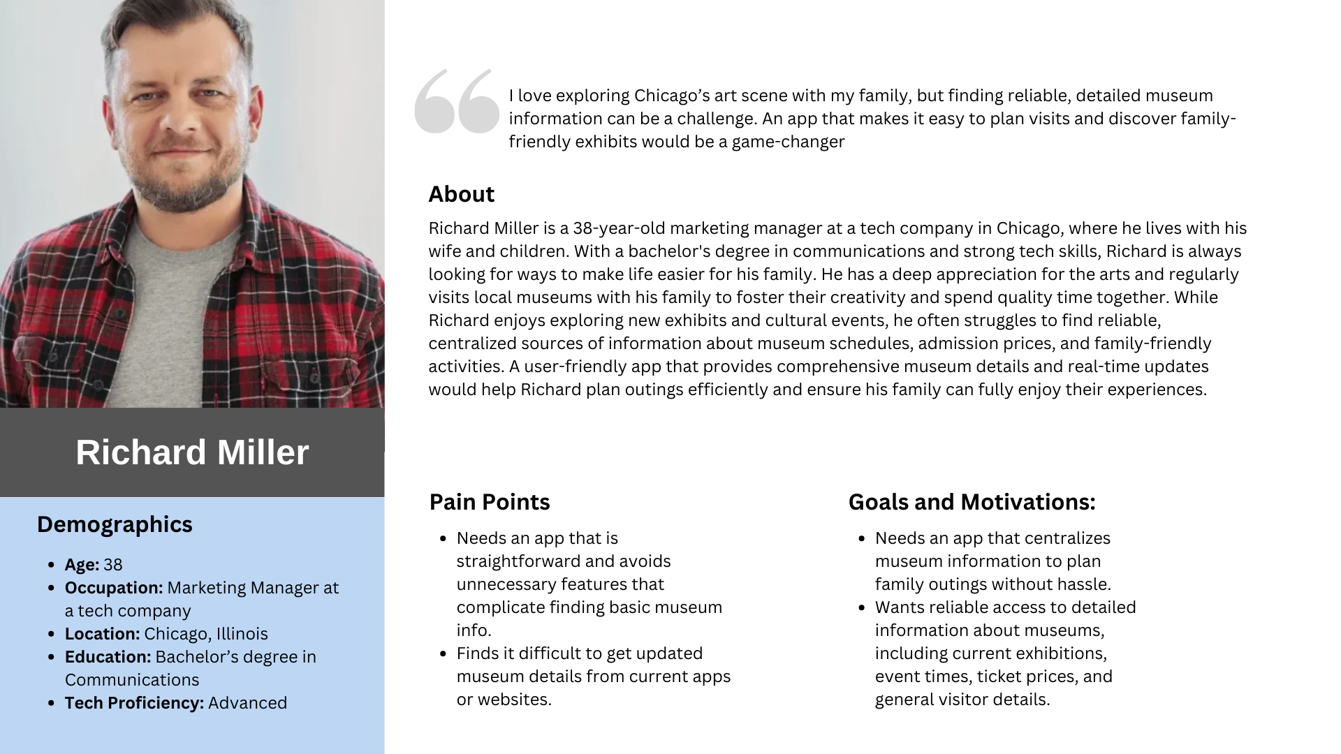
User Personas


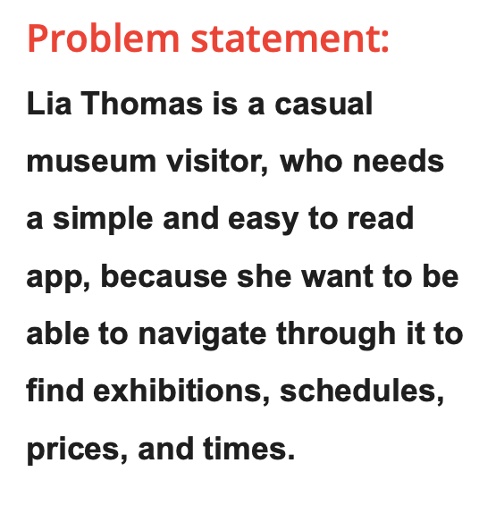
Problem Statement


User journey map
Paper wireframes
Insights
My main goals for the paper wireframes, was to include the main screens that would be featured in the app, sign in, login, homepage, search results, select tickets, and finally the check out page. I designed 5 interactions of each and these were the final designs that come out of them. Each include some elements i enjoyed from my original sketching phase. I overall wanted to make a simple interface, and easy to use app based off of my user research
Digital Wireframes
Usability study: findingS
This usability study had aimed to assess the overall usability, user flow, and design consistency of the app. Participants were asked to perform key tasks, such as navigation, searching, and accessing profile features, while also providing feedback on their overall experience. The study focused on identifying strengths, areas for improvement, and overall user satisfaction.
Changes after Usability study
It was already in my original design but had completely forgotten to create it when I moved to Figma, it was also a point of interest found in my Usability study. Adding a calendar function made more sense and added organization.
Once again, something found in my usability study was the function to add a credit card to have on file to make check out simple. It’s a small detail but definitely is an important function to the app.
Hi-Fi Mockups
Accessibility Considerations
Style Guide